In what ways does your media product use, develop or challenge forms and conventions of real media products?
My magazine cover challenges forms and conventions of real media products because it doesn’t have a bar code or price on it because it is a school’s magazine and it’s free. Also the magazine hasn’t got a kicker. This is because I couldn’t think of one first of all then I realised that I didn’t really want a kicker so I decided not to put it onto my magazine cover. Most magazines have a lot of cover lines on their front cover whereas I only have about 4 cover lines. The magazine is a monthly issue because it was be very hard if it was weekly because the magazine will not hard a lot of articles because not a lot happens in school. Alot of magazine will have an issues number whereas my magazine cover doesn't have it on the cover, however I didn't think about this before because I don't have a bar code so I thought it was needed. However I would have put an issue number on the magazine cover.
How does you media product represent particular social groups?
My media product represents a particular social group because it is a 6th form school magazine so it targets teenagers from the age of 16 and upwards. So the information and articles within the magazine which be directed at the student and written by the students. Also any other topics such as Universities and anything else would be for the students. This is so the magazine doesn't just target the girls but the boys as well.
What kind of media institution might distribute your media product and why?
The magazine is a school's magazine and it free so I don't think that any media institution would distribute the magazine. The School is a major institution containing as they do a whole set of rules and codes which 'constrain and control' the lives of students. So because it is written by the students it breaks this restrain.
Who would be the audience for your media product?
The audience for my magazine are teenagers between the ages of 16-18. This is because it is a 6th form magazine and the age group of the student in 6th form are between these ages so they are the target audience. Even though it is aimed at 16-18 the magazine will still be available for teachers and girls in year 11.
How did you attract/address your audience?
To attract the target audience is by having specific articles and pictures and information which is written by them. This will get them more interested in the magazine which will; encourage them to read the magazine. Also by advertising products which they can win, information which will be useful for them to know, such as University.
What have you learnt about technologies form the process of constructing this product?
I have learnt how to clone pictures and remove any objects from the pictures I do not want. I also learnt how to add new fonts from the internet onto Photoshop which I was able to add onto my magazine cover. I also learnt how to airbrush a photo and change hair and eye colour. Also how to add buttons onto the magazine cover and different types of backgorund style I could use.
Looking back at your preliminary task, what do you feel you have learnt in the progression from it to the full product?
The main thing is that I learnt it takes a lot of time to contrast the magazine to make sure that the cover stands out from the background picture and planning on where to place each of the articles on the page. I have also learnt a bunch of other things which will be very useful for when I start my actual coursework.
Monday 15 December 2008
Monday 24 November 2008
Magazine Cover

The sheet helped us to do our photo shoot for our front cover. We had to use a medium-close up shoot and any choice of location. We had to take the picture on a plain white background and some where else. We had a choice to use any lightings and props if we wanted to. After taking a couple of pictures I chose which one I wanted to use. I decide not to have a plain white or a coloured background because I thought using the picture with the school behind it was very nice and it was the look I was going for. I airbrushed the picture a little bit to make the models face a bit smoother and changed the eye colour. The next was to construct the magazine on PhotoShop. I first decided which three colours I was going to use and which one stood out from the background. Next I choose what the articles which was going to appear on the front cover in what front. I decide to only use three colours and fonts so that the magazine didn’t look too crowed or messy. I used black, blue and yellow and download fonts off the website 1001freefonts.com an added a button to make the magazine stand out. I began to play around to see where the articles looked best on the magazine and the different sizes.
Cover Plan

Planning: Own cover
Using the secrets of the magazine cover I had decided on how I want my magazine to look like. I’m going to base my magazine on the 6th form rather than the lower years. Because the 6th form is mixed I want to make sure that it appeals to both sexes. To achieve this I will make sure that the different factors which will be used to create my magazine appeals to both the girls and boys.
Fonts: the types of fonts which I’m going to use are decorative and a sans serif font. I’ve decided not to use a script-style font because it’s too elegant which would appeal to my target audience which are teenagers aged 16-18.Colours: because it’s going to be a mixed magazine it would be obvious to use pink and blue, however I had decided to use yellow blue and black. Also to make the colours stand out I will use contrasting coloured background.Images: the image will include both male and female on the cover on a scenery background so that it looks more interesting than if it was on a plane background also so I’m not biased towards the females or males.
Rule of thirds: when taking the picture for my magazine I will make sure that the readers are drawn to the middle of the magazine.Mode of address:
Semiotics: I will not use any semiotics because I think it is unnecessary for a school magazine to have a semiotics.Name of magazine: the name of the magazine is going to be called ‘TOAST’.
When I finished planning my magazine cover I than had to plan the photo shoot itself. Using this sheet below:

Table of Context

I wanted to use different colours than the ones I used on my front cover. This was because if I used the three colours as the background the black would have been to dark and the blue and yellow were too bright. So I decided to use grey, white and black. I used grey background white spirals in the middle which I designed on PhotoShop. I also matched the fonts with the same colour coordination. The main cover stories and the page numbers are in black. The description of the articles and the articles which are on the right-hand side are in grey. I used different shades of grey to it blended in with the magazine but it still stood out.
Table of Context Plan

After I had finished my magazine cover I made a plan for my context table. For my table of context I wanted it to be very simple compared to the magazine cover. I designed a very simple design because the magazine itself is quite simple. I had the main cover stories on the left-hand side of the page with the page numbers on the right-hand side. Over information such has horoscope and competitions on the right-hand side and the page number on the left-hand side. I also wanted the fonts in different sizes and different colours so each section stood out.
Monday 17 November 2008
Cloning image
Original image New image


The original you are able to see the women in the background climbing the stairs and the logo on the girls bags ‘Zara’, ‘Just do it’ and ‘Dior’. We learnt how to clone out these factors from the pictures on Photoshop. We did this on a photograph of students from SMS this was because by removing corporate branding from the image so that it could be suitable in the school prospectus. Also by removing these factors it does not take away the reader’s attention.
Colour popping image/ Colour filtering
Original Image New Image


During the lesson we had to air brush a picture. I opened up the picture which was saved on the C: drive onto Photoshop. 1st I duplicate the layer so I can do all the changed on the copy background and not the main picture itself. I next blurred the background to give her face a smoother look. To achieve this on the tool bar I click on filter blur then I used Gaussian blur to blur the picture to about 2.4-2.6 pixels. Next I erased the eyes, nose, eyebrow and mouth so it stands out from the blurred face. Secondly I changed the eyes of the model from a blue colour to a brown/hazel colour. By clicking on the brush tool and changing the size so it’s roughly the same size as the models’. Before making any changes to the picture I must make a new layer so it would be easy to change anything instead of having it on one layer. To make the eye colour blend it I would have to change it to soft light or overlay to make it look more realistic also I had to change the opacity again to make the picture look realistic. Lastly I changed the hair colour I decided to make it a bit darker using the same process as changing the eye colour. I choose which colour I wanted, used the brush tool and coloured in her hair. Next I changed it to soft light and the opacity.
Original image New image


The original you are able to see the women in the background climbing the stairs and the logo on the girls bags ‘Zara’, ‘Just do it’ and ‘Dior’. We learnt how to clone out these factors from the pictures on Photoshop. We did this on a photograph of students from SMS this was because by removing corporate branding from the image so that it could be suitable in the school prospectus. Also by removing these factors it does not take away the reader’s attention.
Colour popping image/ Colour filtering
Original Image New Image


As you can see the original picture is in full colour whereas the new image is in black and white however I made the green and the yellow stands out from the picture. This was done by toning down the background, making a new layer and colour in the whole picture except for the green and the yellow. To create the effect of a colour popping image I opened the picture that I was going to change so what I did first was to adjust the layer. To do this I turned down the hue saturation to -100 so the picture was in black and white and unlock the layer so the image was invisible. Using the brush tool down the right hand side of the column and enlarge it and coloured the foreground black using the colour replacement brush. Next using the lasso tool I pick the colour which I wanted to stand out from the picture. So by creating a new layer I was able to go over the picture again but leaving the
Fonts
We were given five different font websites which we were able to use to download free font of our choice. The website which I used was http://www.1001freefonts.com/ which had loads of different styled fonts which I felt I was able to use. To install the different fonts I had to:
· Download the fonts has a zip file from the website
· Open it up on the WinZip folder using the evaluation version
· Go o my computer, C: drive, Windows folder, Fonts folder: C:/WINDOWS/Fonts
· Drag and drop from the Zip folder to the fonts folder


These are some examples of decorative fonts and a script-style font. The decorative fonts can be used for occasions such as a birthday card because it is playful whereas script-style fonts may be used for wedding invitation because it formal and elegant looking.
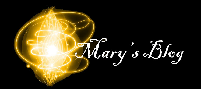
Colouring effect
Original Image New image


To create the multi-coloured affect on the picture I had to create a new layer and I chose different colours to highlight the shape in a rainbow affect by using the brush in swirly affect.
Fonts
We were given five different font websites which we were able to use to download free font of our choice. The website which I used was http://www.1001freefonts.com/ which had loads of different styled fonts which I felt I was able to use. To install the different fonts I had to:
· Download the fonts has a zip file from the website
· Open it up on the WinZip folder using the evaluation version
· Go o my computer, C: drive, Windows folder, Fonts folder: C:/WINDOWS/Fonts
· Drag and drop from the Zip folder to the fonts folder


These are some examples of decorative fonts and a script-style font. The decorative fonts can be used for occasions such as a birthday card because it is playful whereas script-style fonts may be used for wedding invitation because it formal and elegant looking.
Colouring effect
Original Image New image


To create the multi-coloured affect on the picture I had to create a new layer and I chose different colours to highlight the shape in a rainbow affect by using the brush in swirly affect.
Air Brushing
Original image New image


During the lesson we had to air brush a picture. I opened up the picture which was saved on the C: drive onto Photoshop. 1st I duplicate the layer so I can do all the changed on the copy background and not the main picture itself. I next blurred the background to give her face a smoother look. To achieve this on the tool bar I click on filter blur then I used Gaussian blur to blur the picture to about 2.4-2.6 pixels. Next I erased the eyes, nose, eyebrow and mouth so it stands out from the blurred face. Secondly I changed the eyes of the model from a blue colour to a brown/hazel colour. By clicking on the brush tool and changing the size so it’s roughly the same size as the models’. Before making any changes to the picture I must make a new layer so it would be easy to change anything instead of having it on one layer. To make the eye colour blend it I would have to change it to soft light or overlay to make it look more realistic also I had to change the opacity again to make the picture look realistic. Lastly I changed the hair colour I decided to make it a bit darker using the same process as changing the eye colour. I choose which colour I wanted, used the brush tool and coloured in her hair. Next I changed it to soft light and the opacity.
Subscribe to:
Posts (Atom)